Volcanic Ash Rebrand
Born from a memory, Volcanic Ash is a small business based in New Hampshire with an obsession with re-creating a Mexican style sauce from a time past. With gloves and gasmasks donned, this team strives to bring the flavor that will kick your ash.
In this project, I took a company who’s brand could have used a facelift, and reworked it from the ground up. This includes the Logo, Website, and Packaging. (Though I didn’t touch the hot sauce recipe!)
Client: Volcanic Ash Hot Sauce
Service: Rebrand
Skills: Branding, UX, UI
Logo
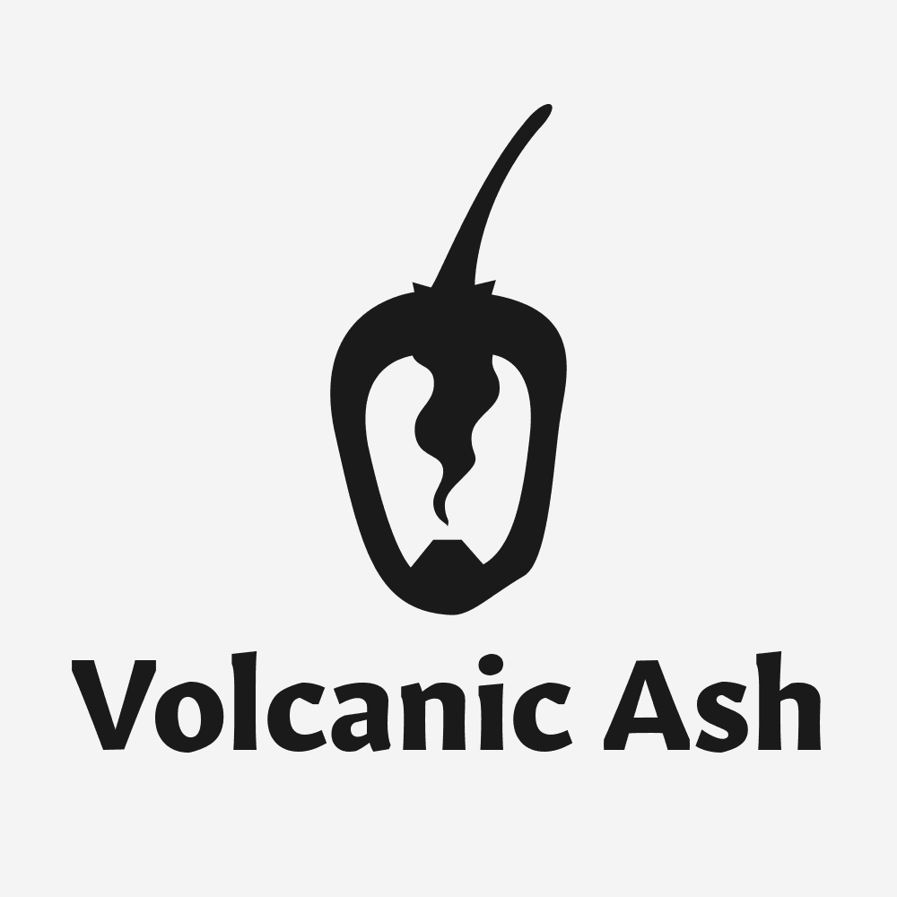
Throughout the exploration of the brand, it was clear that they love habanero peppers. It is an integral ingredient in their sauce and I thought that it should be the focus of the brand itself. After a bunch of sketches and crumpled post-its, I arrived at this final design. I thought that the active volcano in place of the habanero core was a clever solution to combining the two focuses of the brand.
Website
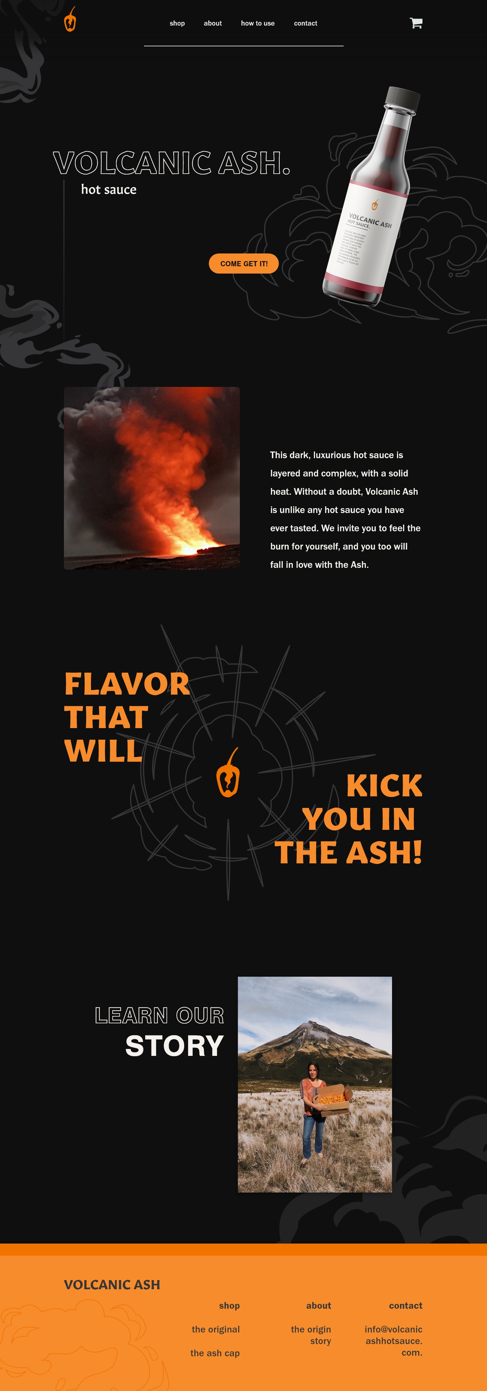
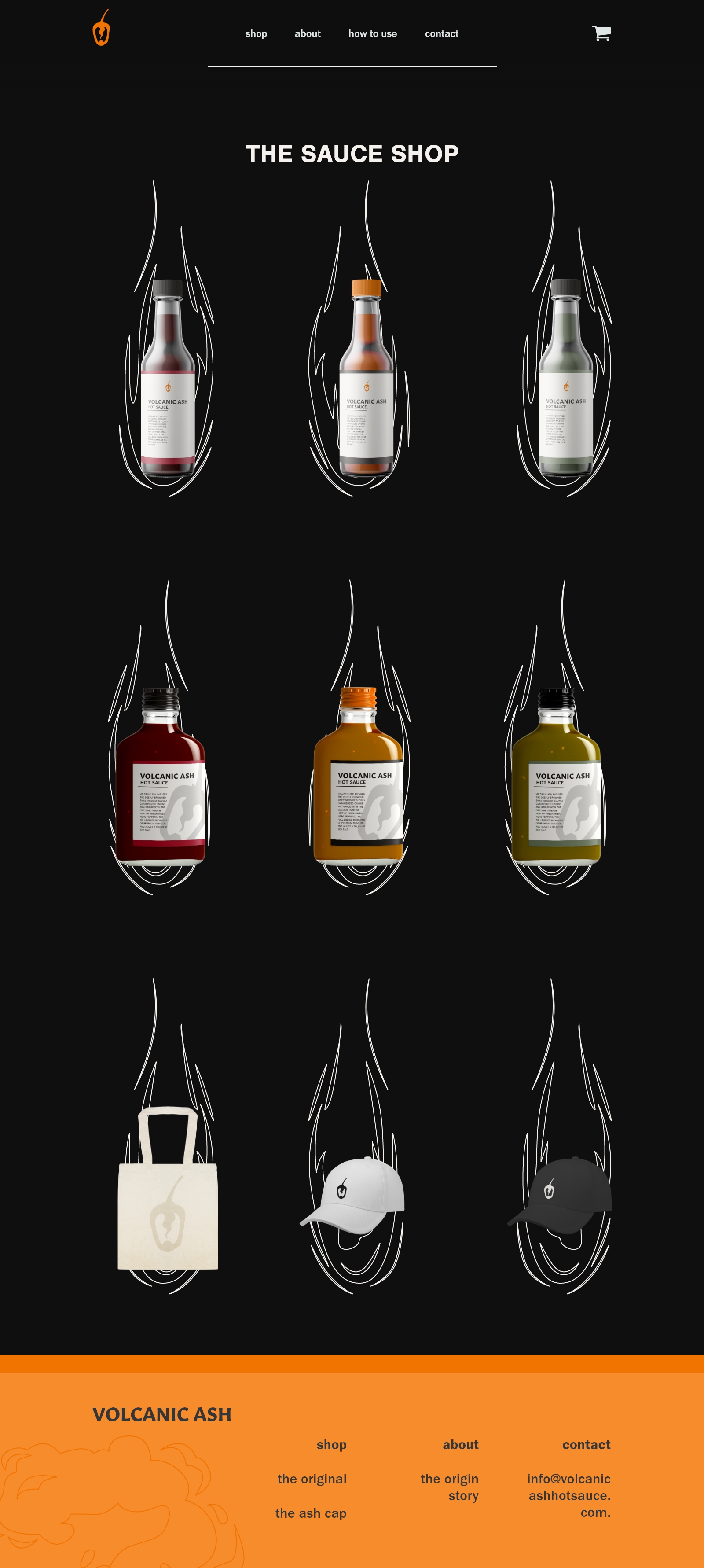
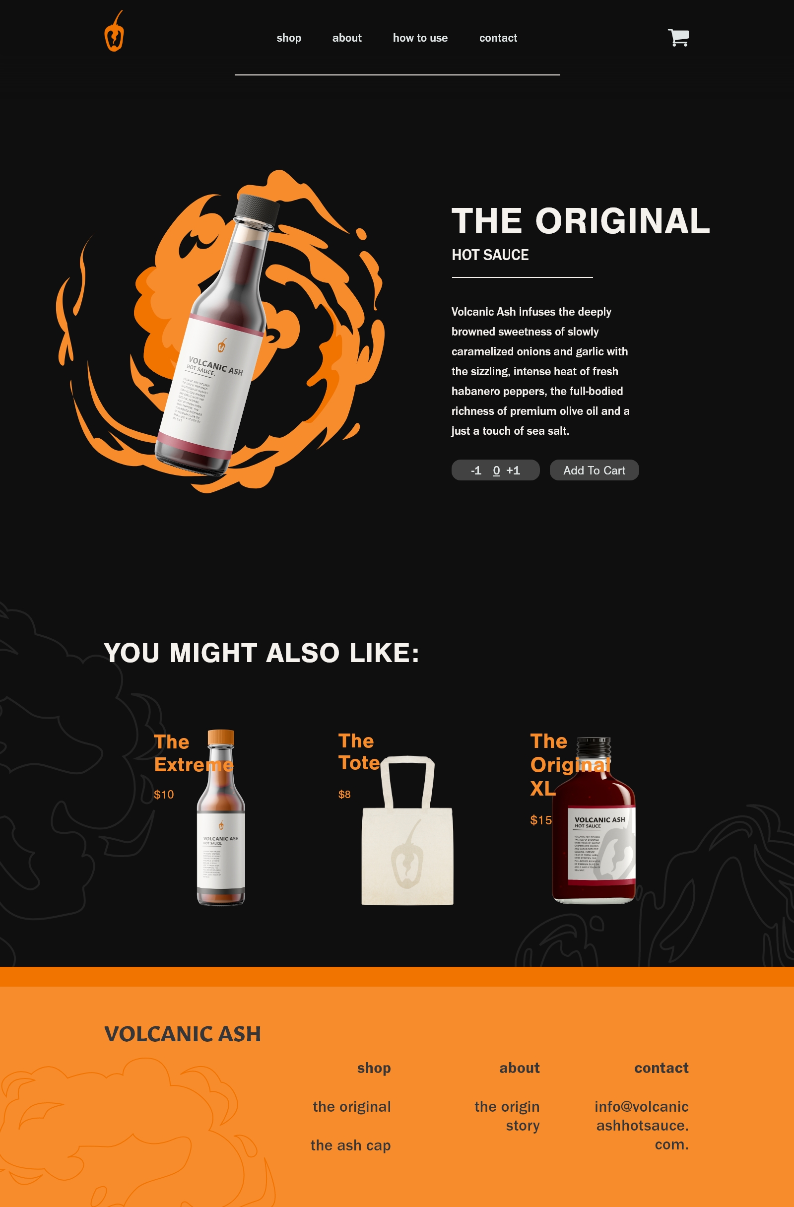
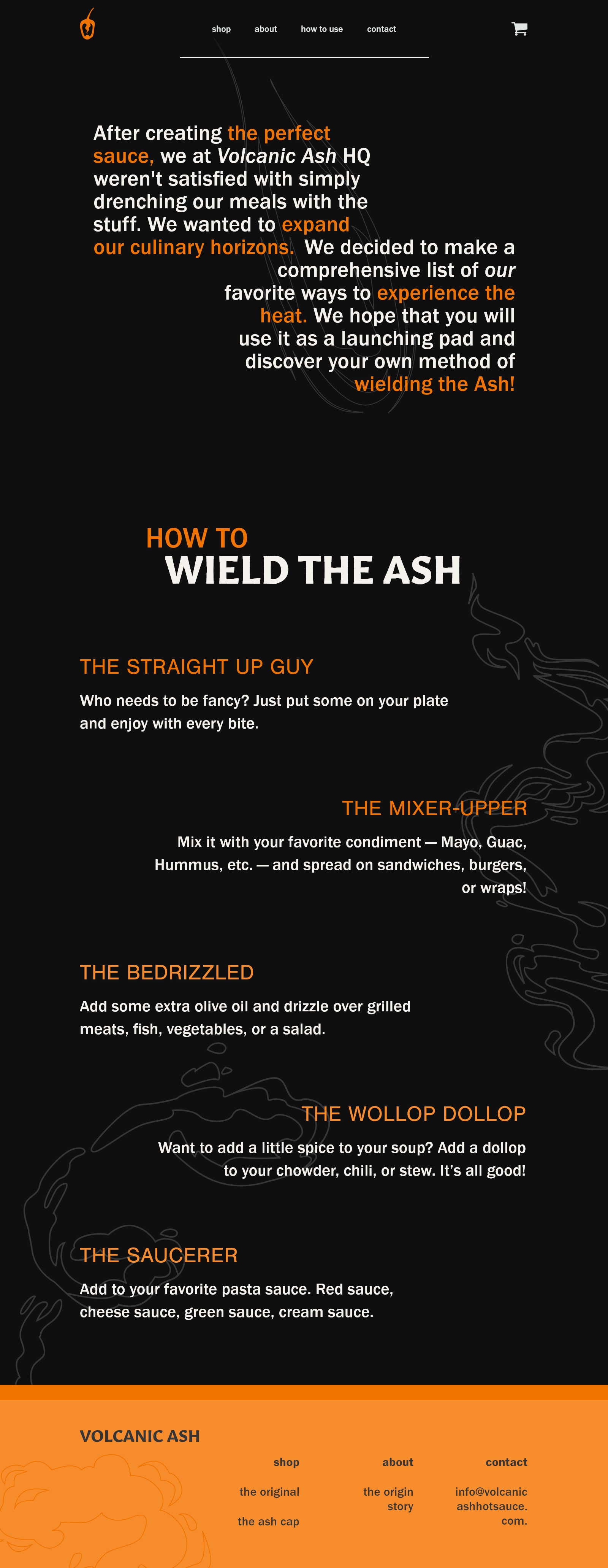
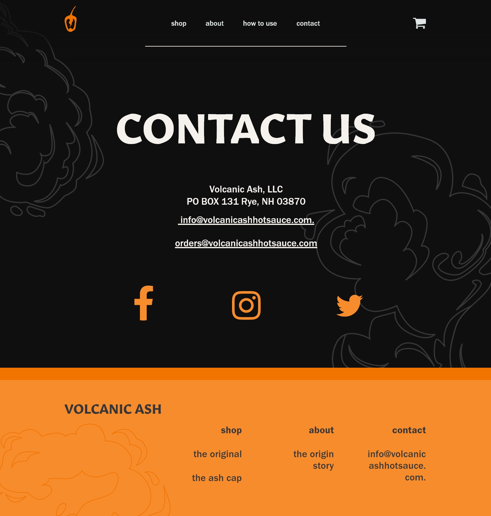
The original website needed a major remodel. The main things I noticed: the sitemap was confusing, the hero page didn’t showcase the product, and there seemed to be a lack of organization in general. I liked that the company didn’t take themselves too seriously and included a “how to use” page. I wanted to keep that playfulness alive in the redesign so I added cartoon smoke outlines in the background. I also added the pop of orange to mimic the pop of heat coming from the hot sauce.
