Naos
Services
Branding
Identity
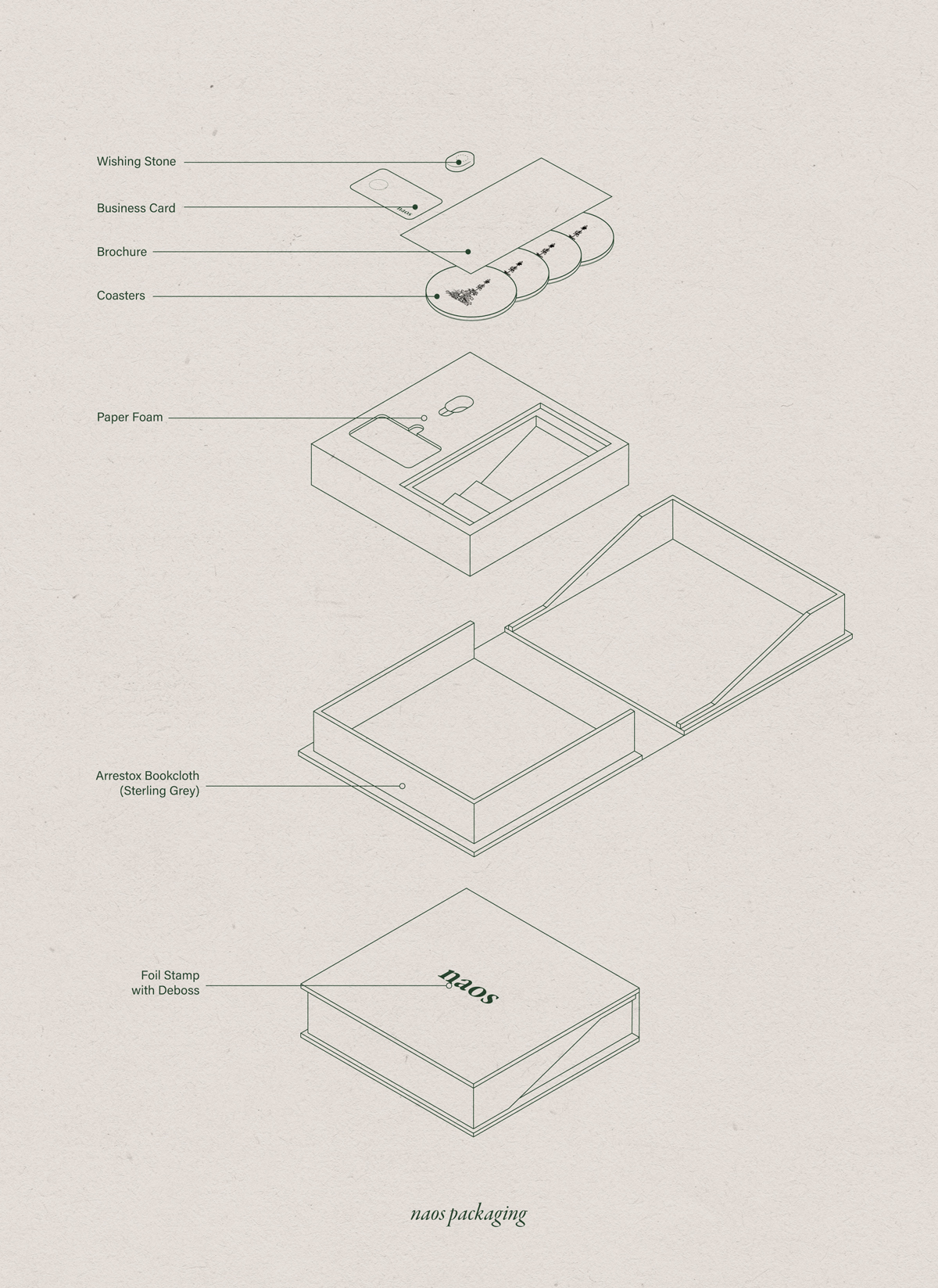
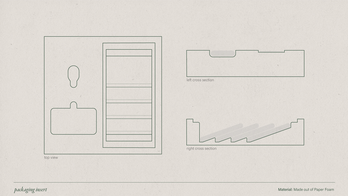
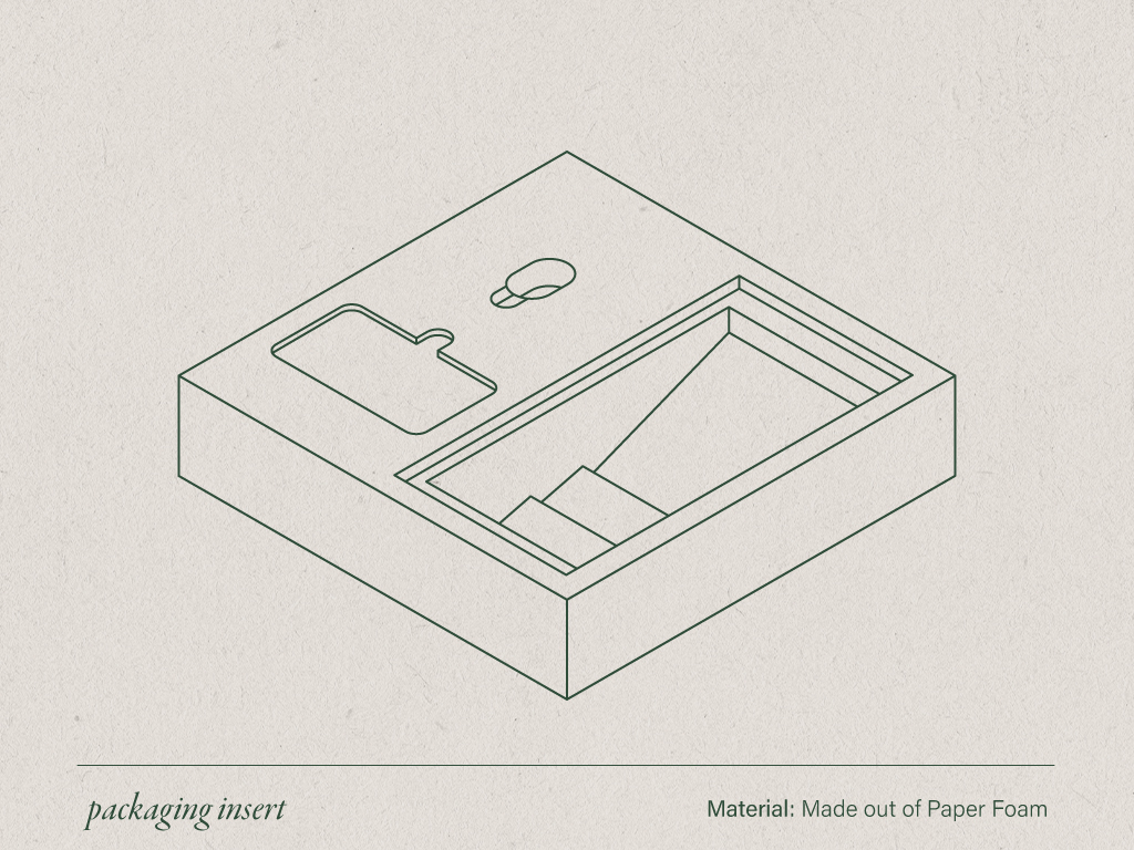
Packaging
Client
Naos
Year
2021
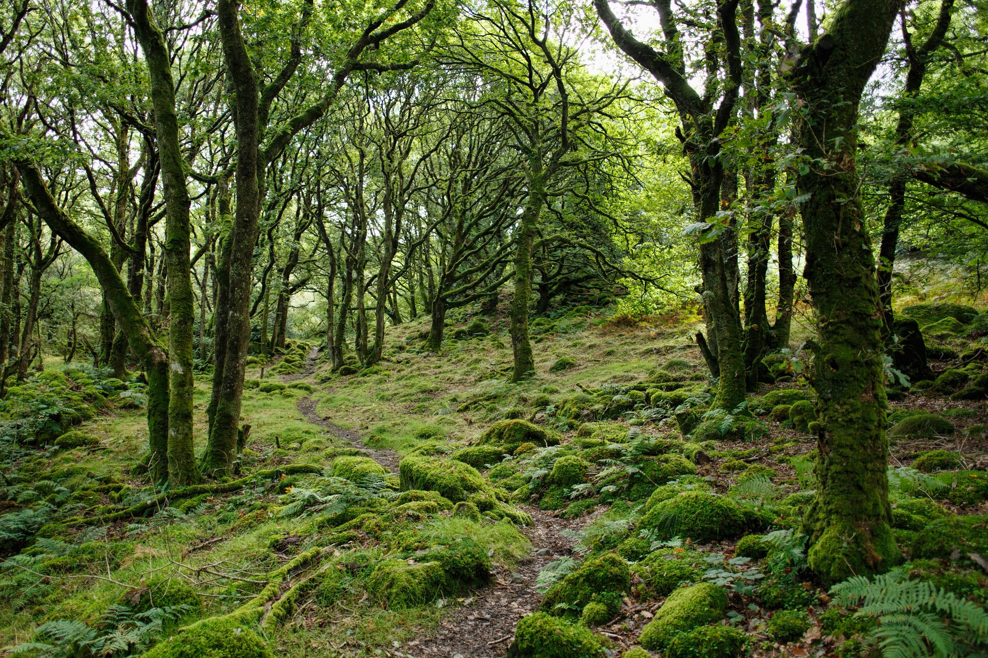
Naos creates quality time with quality design, building personalized in-home terrariums that become sanctuaries. Using handpicked plants grown in a private greenhouse, they guarantee that you will be surrounded by fresh and healthy flora that will soothe the mind. The goal of this project was to develop a brand identity that communicated the relaxed, quality, and hardworking attributes of the company.
With a company revolving around relaxation as the focus, the brand touchpoints relied on the user experience as much as the visual design; this didn’t just apply to the digital mediums, but the physical deliverables as well.
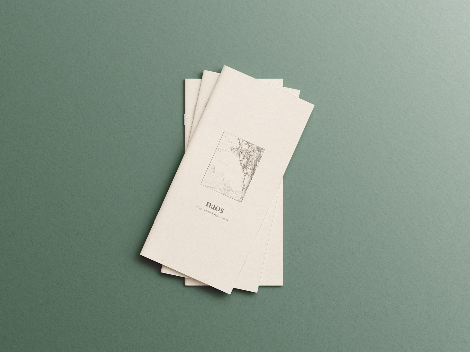
Naos (ney-os) is a Greek word that refers to the innermost chamber of a temple, it is a place for solitude. I wanted to keep the logo simple to convey that brand value and decided to focus on finding a typeface for a wordmark. Garamond Premier Pro seemed to be the perfect fit, its old-style serifs connecting well with naos origins creating an established feeling to the mark. Garamond is used primarily for the logo but also used in special cases, it is supported by Acumin which brings a modern feel to the brand and contrasts well with the serif.
The color palette stays away from contrast and ops for earthy desaturated shades. The dark browns, whites, and greens stick close to natural colors that Naos is attempting to emulate. I wanted to include illustrations of landscapes and foliage throughout the brand. I gathered open-source print illustrations from the New York Public Library’s digital collection, and photoshopped them into collage pieces I could scatter across the brand.


interested in working together?